Client Media
New Logo
Celtic Frost Herbs
Old Logo
This rebrand for Celtic Frost Herbs centers on clarity, recognition, and longevity through a more refined visual identity. The new logo strips away unnecessary complexity in favor of a clean, symmetrical mark paired with understated typography, allowing the brand to feel both modern and rooted in tradition. By simplifying the form and focusing on balance and negative space, the design becomes far more versatile and instantly recognizable across applications, from packaging to digital use. This approach not only strengthens brand recall but also aligns with the natural, intentional qualities of the products themselves, creating a mark that feels calm, grounded, and memorable in a way the previous logo could not achieve.




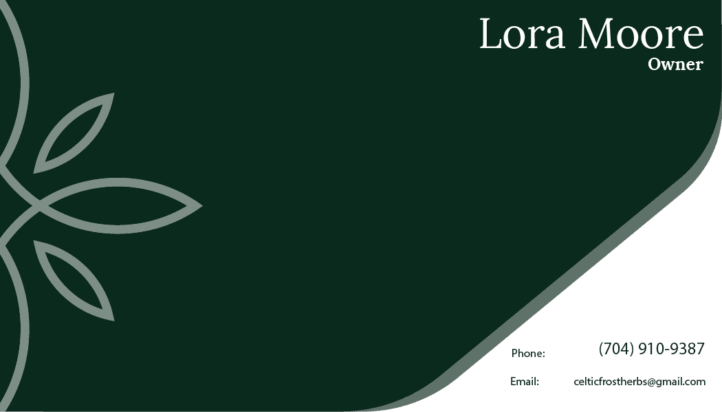
Business Card
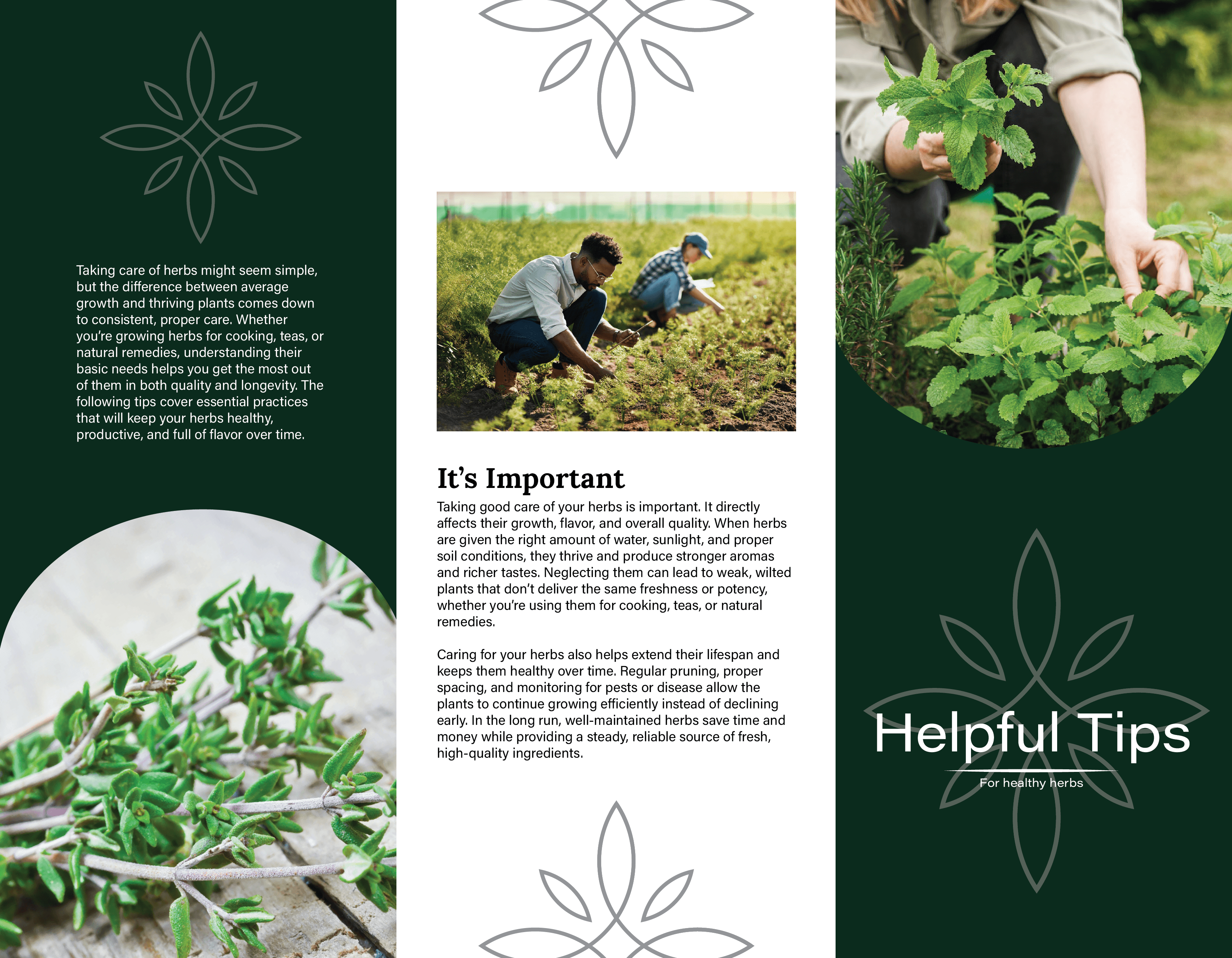

Info Pamphlet
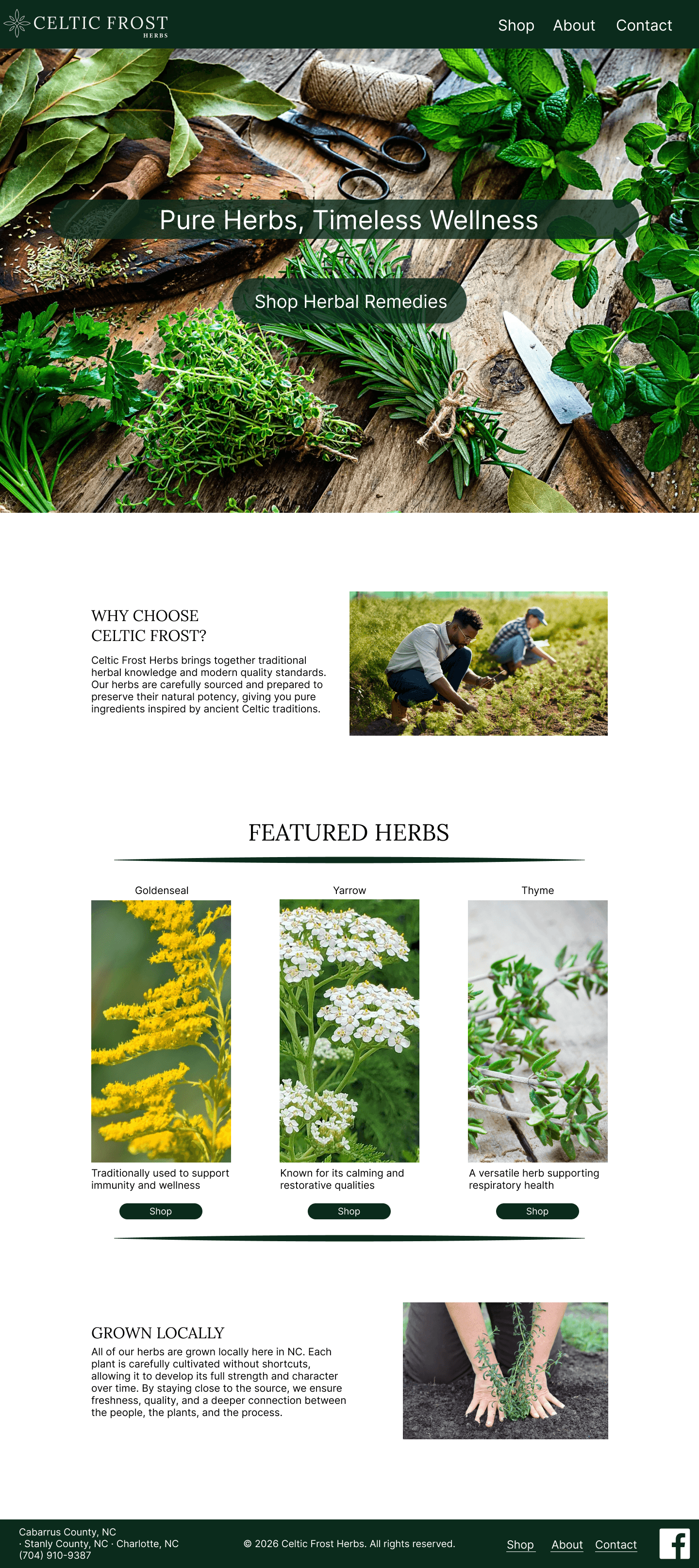
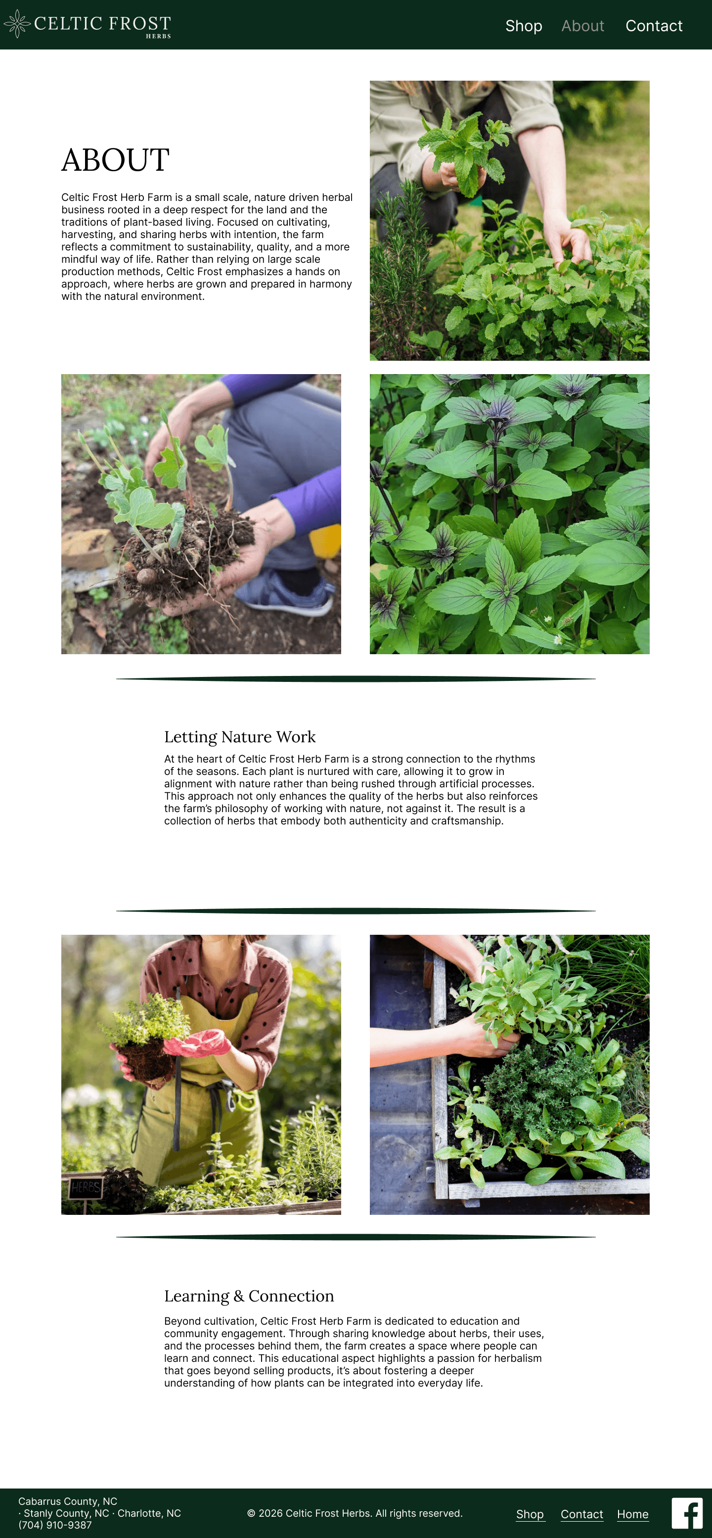
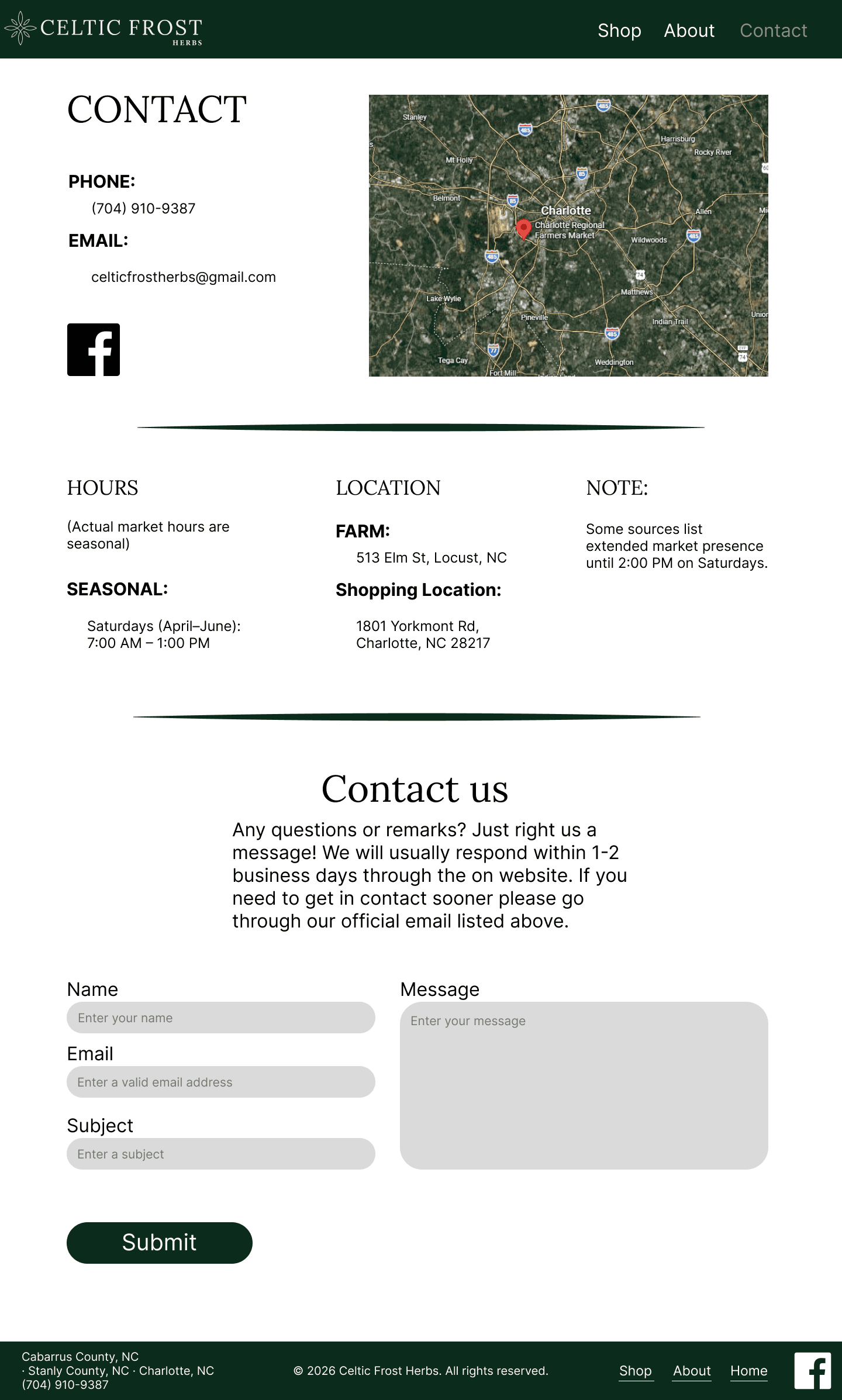
Website
Personas
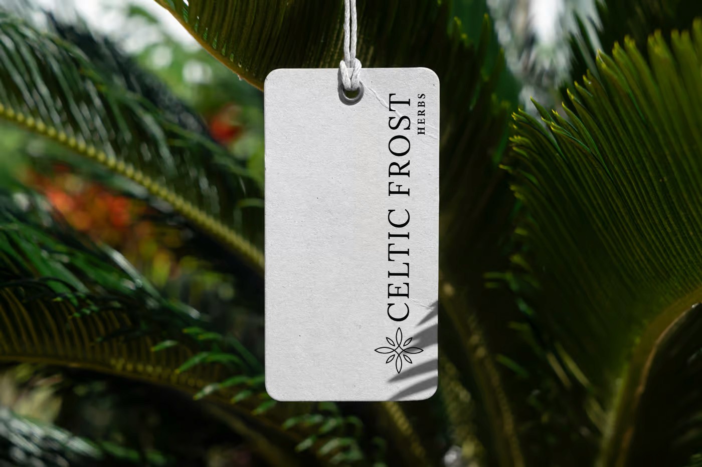
Leave Behinds


Testing & Journey Map
© 2026 Dapper Design. All rights reserved.
Design Dressed Well