Illustration
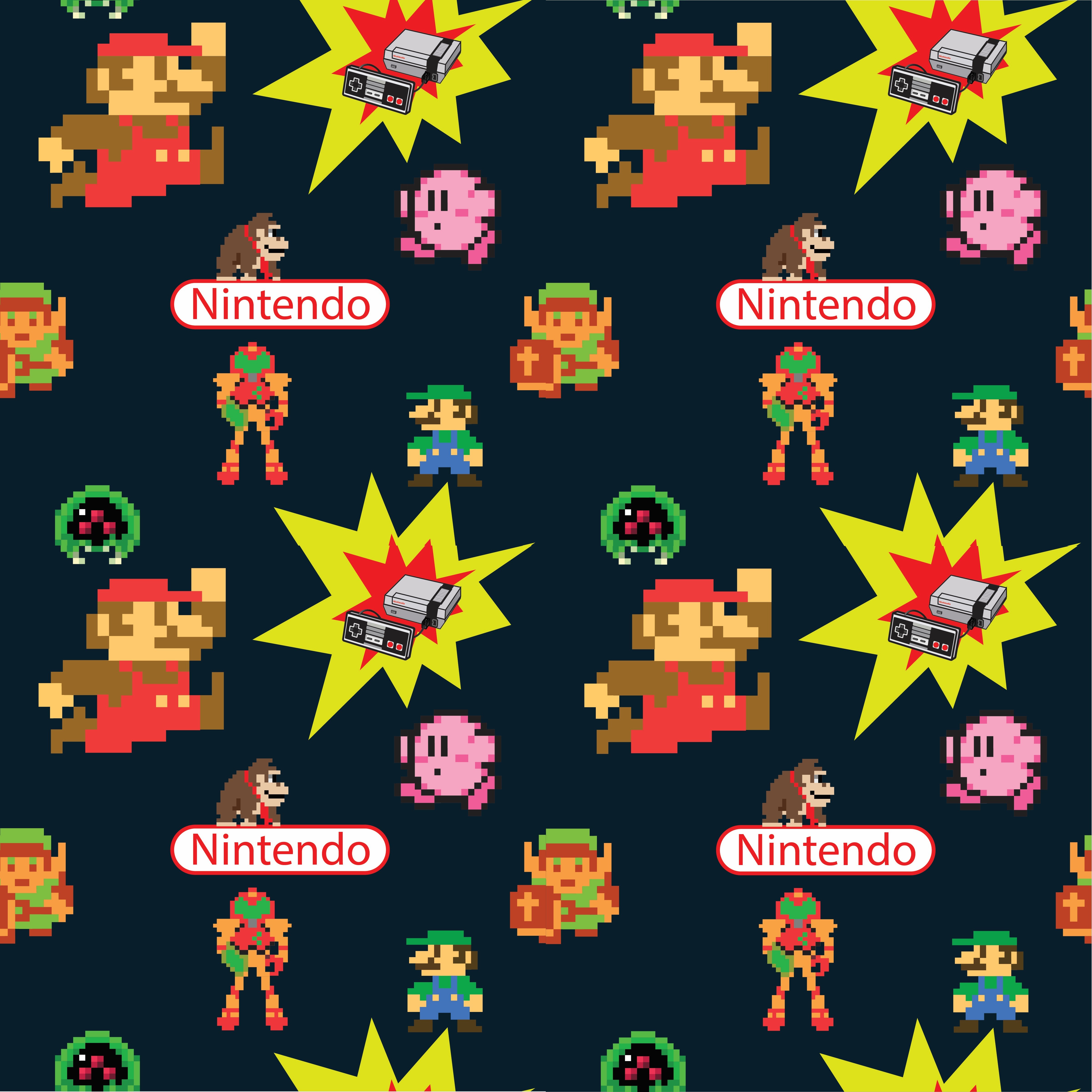
Pixel art, digital rendering, and vector logos are the mediums of choice for this nostalgic Nintendo tapestry. A deep charcoal backdrop and vivid primary colors play a role in portraying these iconic 8-bit heroes across a seamless, repeating field. Radiant bursts of yellow both on the action starbursts and sprinkled throughout the composition provide contrast and a visual reference to the high-energy excitement of the classic arcade era. This dense, scattered arrangement allows a variety of legendary franchises to coexist in a single, unified landscape that masks surface wear while keeping the viewer’s eye in constant motion.
Classic Nintendo Pattern

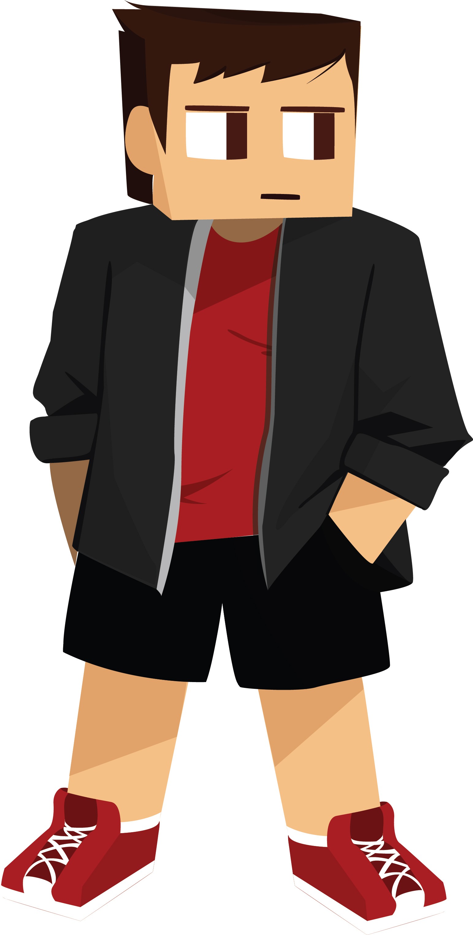
This character design presents a confident, approachable gamer persona using a clean, stylized illustration style. The simplified shapes, bold outlines, and neutral clothing keep the design modern and relatable. The bright cyan pixelated sword becomes the focal point, clearly tying the character to Minecraft and gaming culture. His relaxed pose and smirk give him personality, making the design strong for use as a personal brand icon or YouTube avatar.
This character uses a blocky, Minecraft inspired style with simple shapes and flat shading for a clean, modern look. The red shirt and sneakers add bold contrast against the dark jacket and shorts, creating a clear focal point. The relaxed pose and neutral expression give the character a calm, confident vibe, making it strong as a gaming avatar or personal brand icon.
Quigon-Genesis
YouTube Icons
ABigSushi


Alan Walker
Campaign
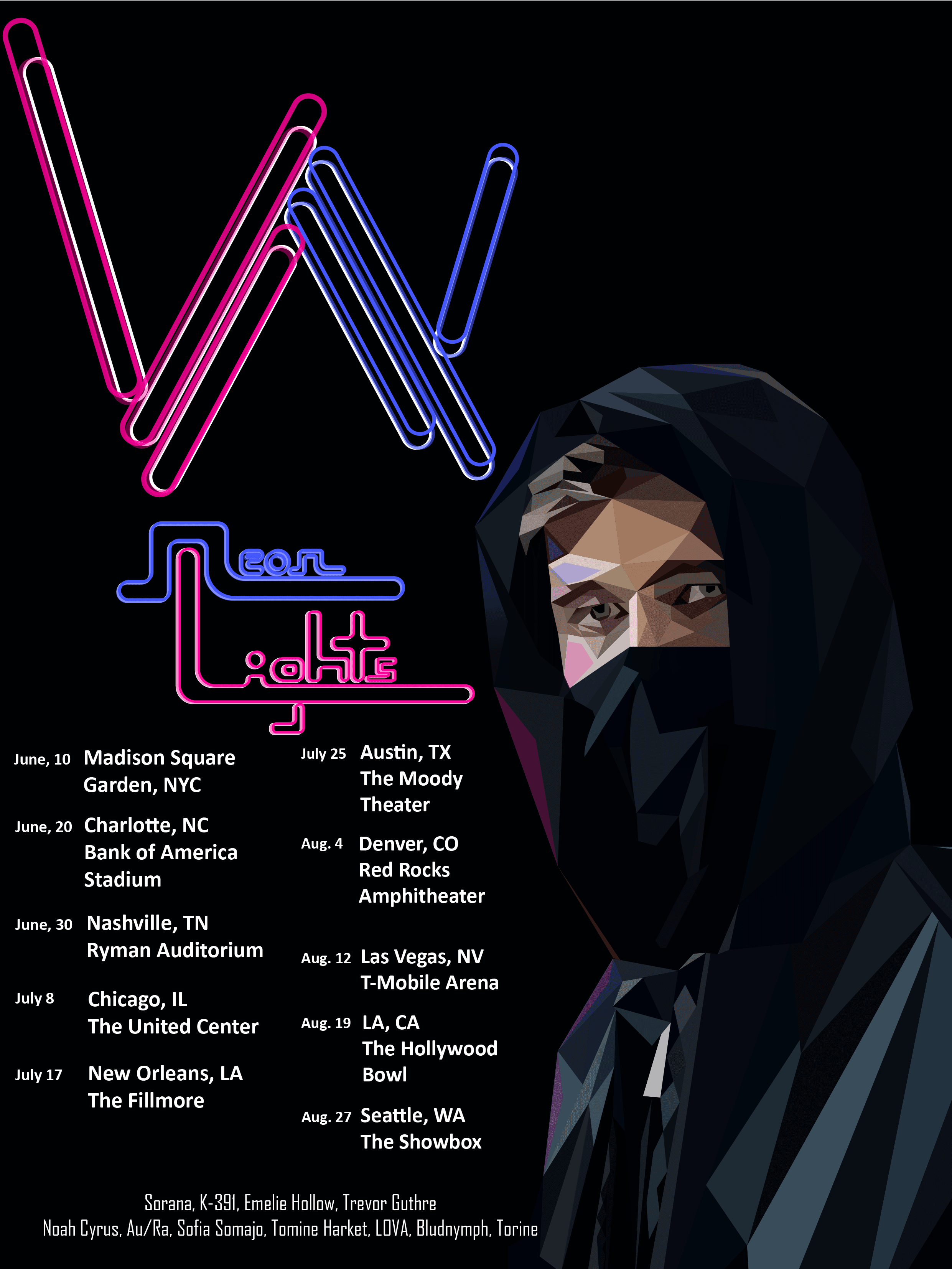
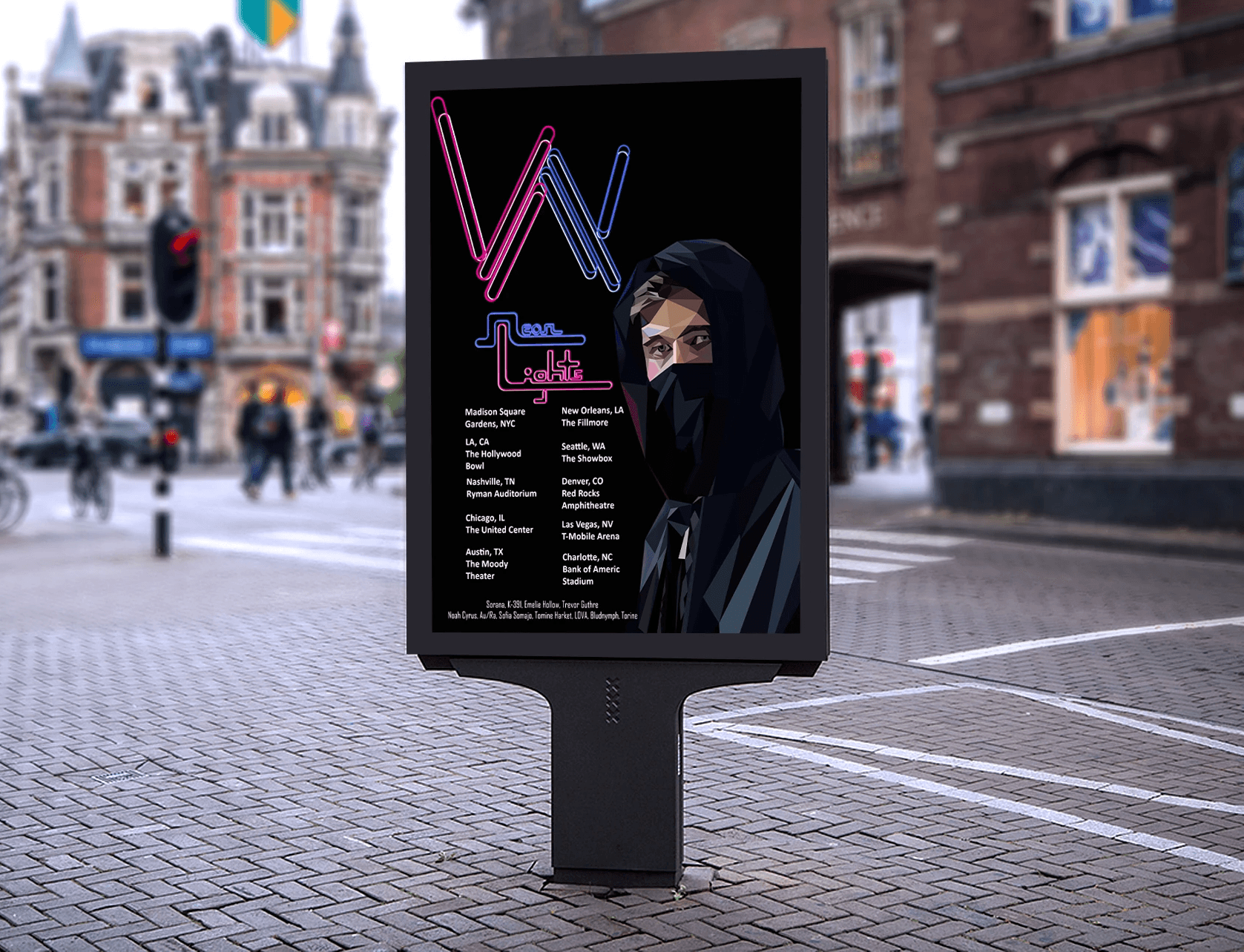
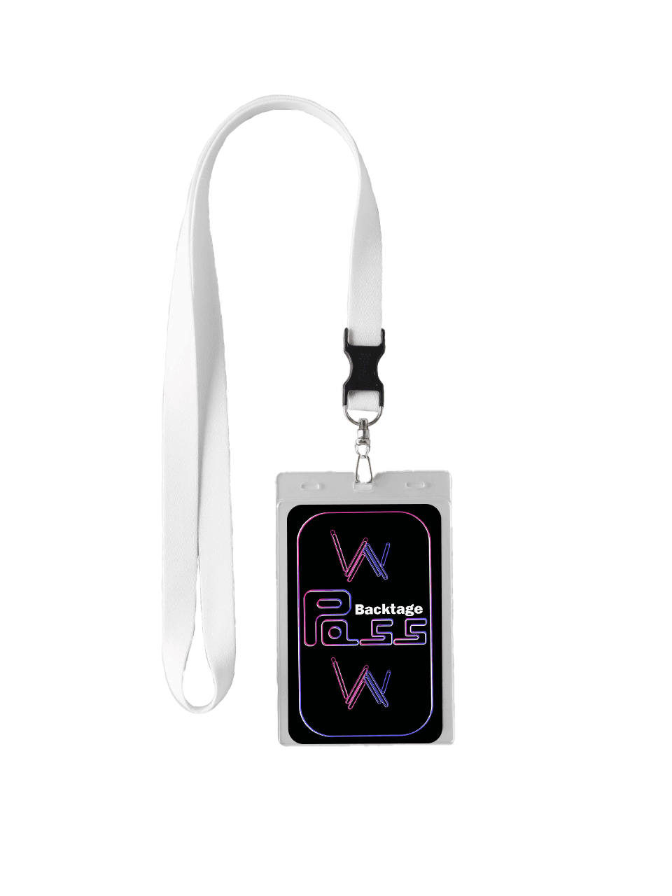
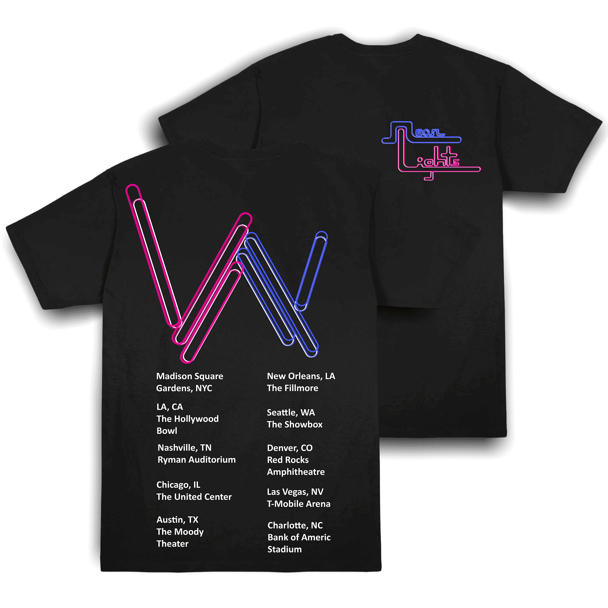
This design is a tour poster for Alan Walker, and I wanted it to match his style and overall vibe. I used neon-style typography to give it a futuristic and electronic feel, which fits his music. The low-poly portrait on the right helps represent his identity while keeping that mysterious look he’s known for. I also kept the background dark so the colors stand out more and draw attention. The tour dates are organized into two columns to keep everything clean and easy to read. While working on this, I learned how important it is to match the design to the artist’s brand. I also got better at using contrast and hierarchy to guide the viewer’s eye through the poster. This project helped me improve at mixing illustration with typography while still keeping the layout clear and balanced.
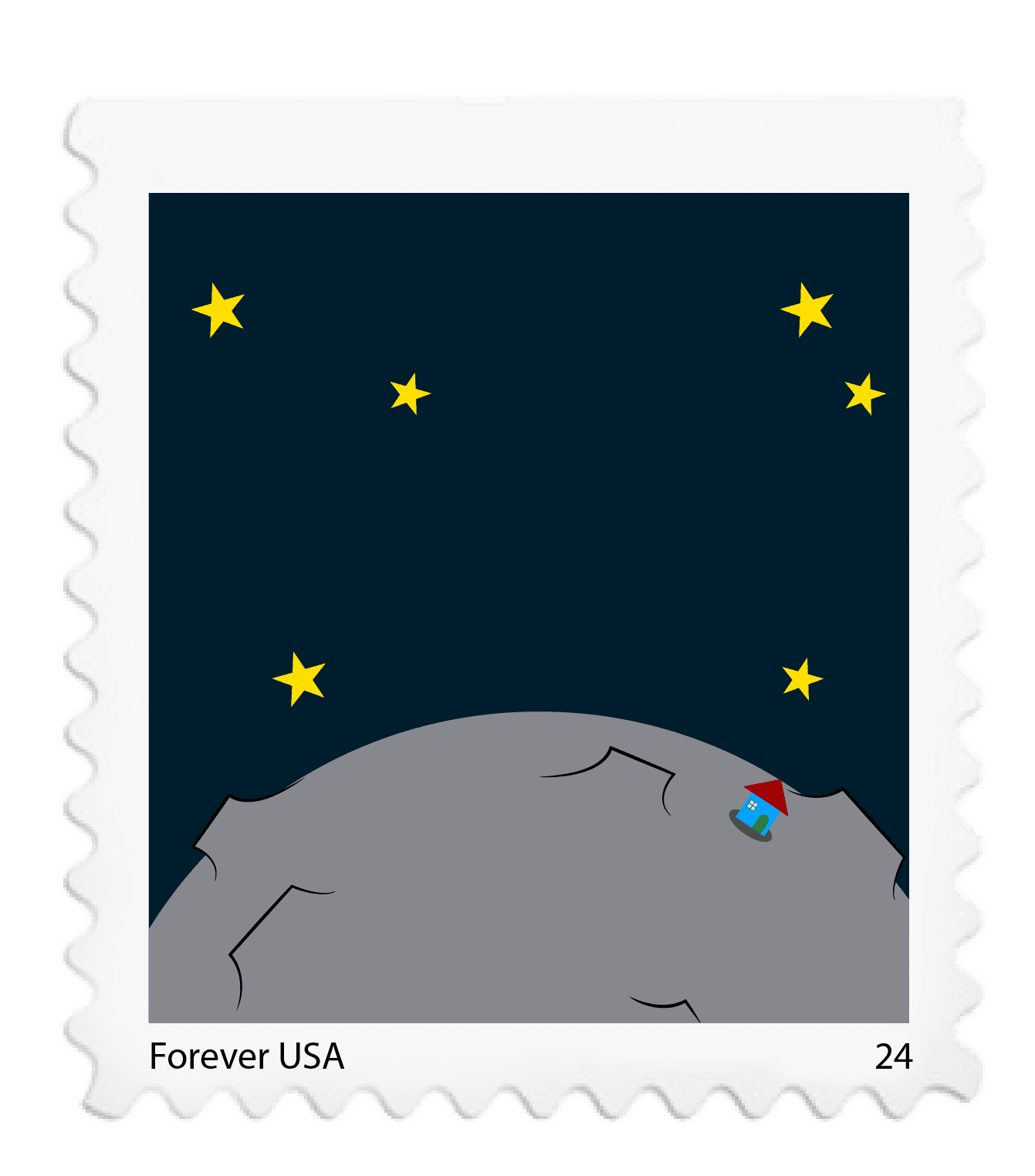
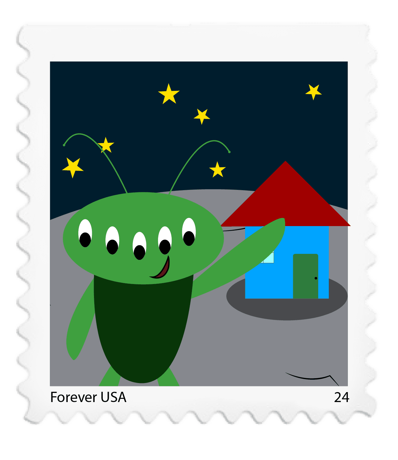
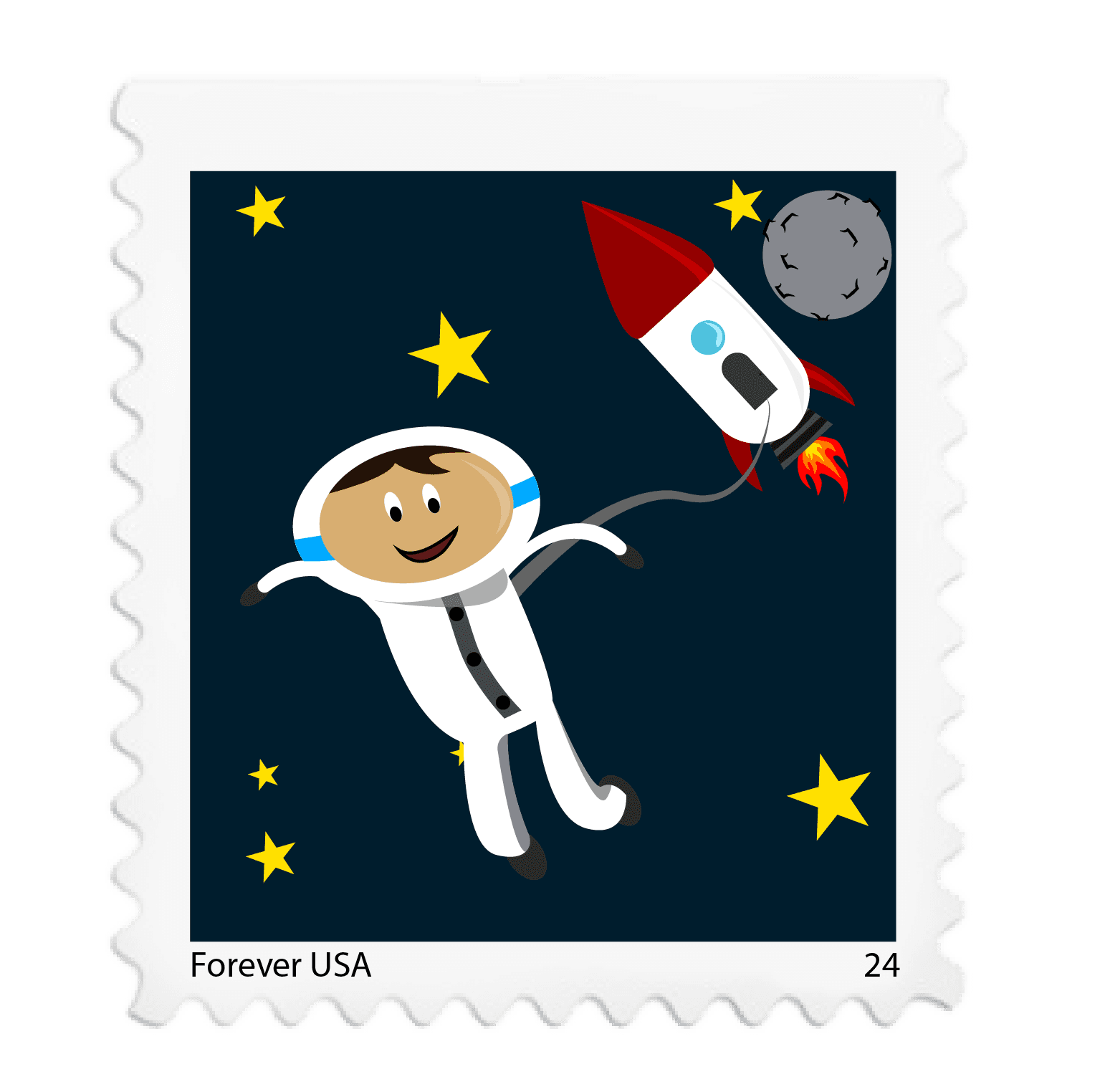
Cartoon Stamps
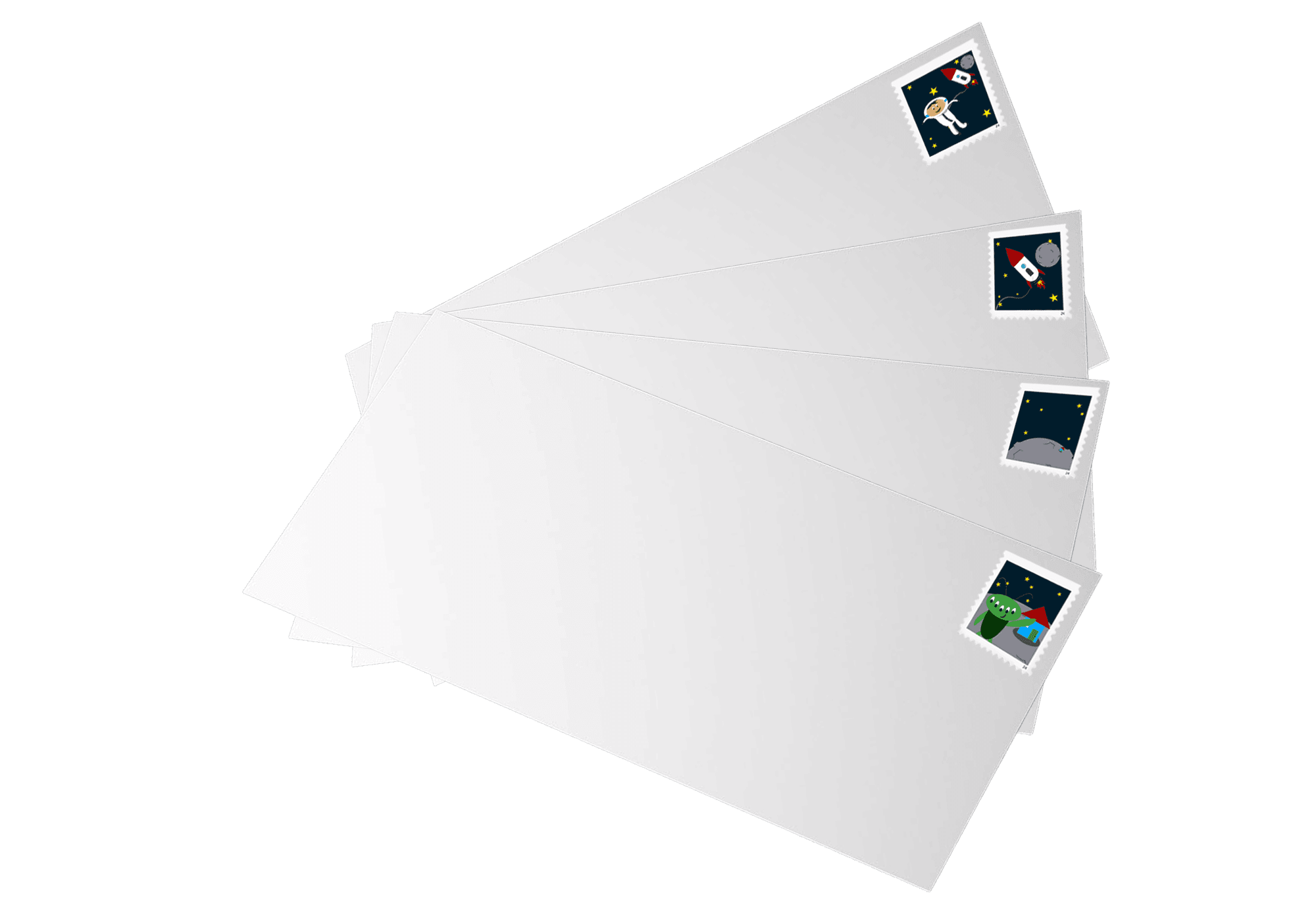
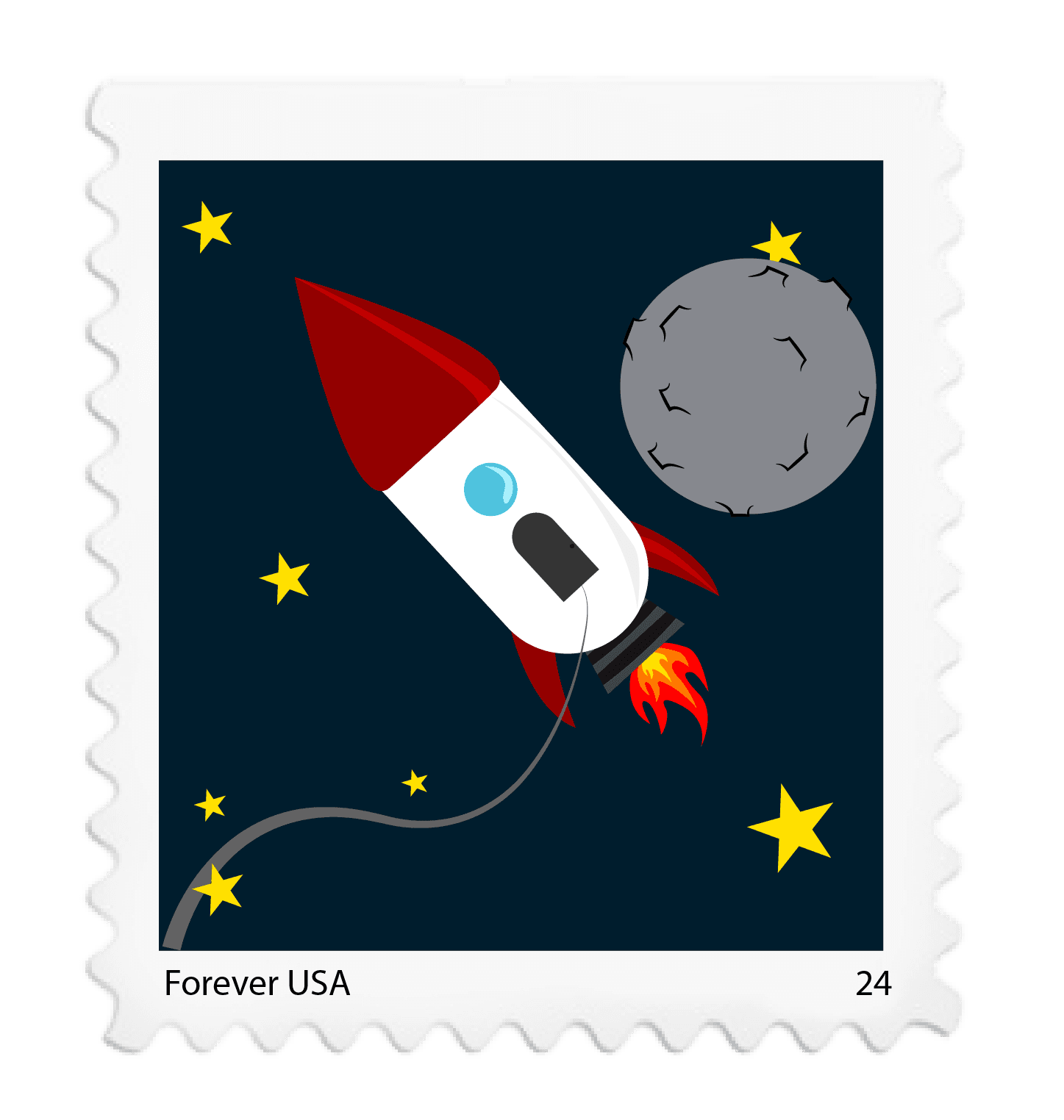
These stamps use a clean, playful illustration style with bold colors and simple shapes to create a
fun space theme. Each design shows a different
moment, an astronaut, a rocket, a planet, and an
alien, while keeping a consistent look and layout.
The bright colors and clear contrast make them
easy to read at a small size, and the matching
stamp borders tie the whole set together into one
cohesive series.
© 2026 Dapper Design. All rights reserved.
Design Dressed Well