UI/UX
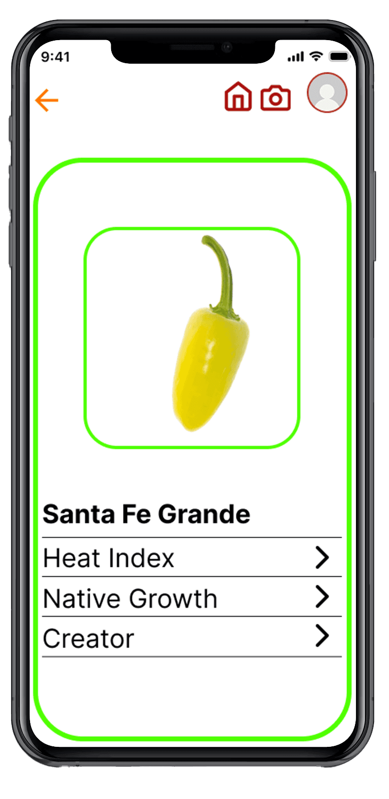
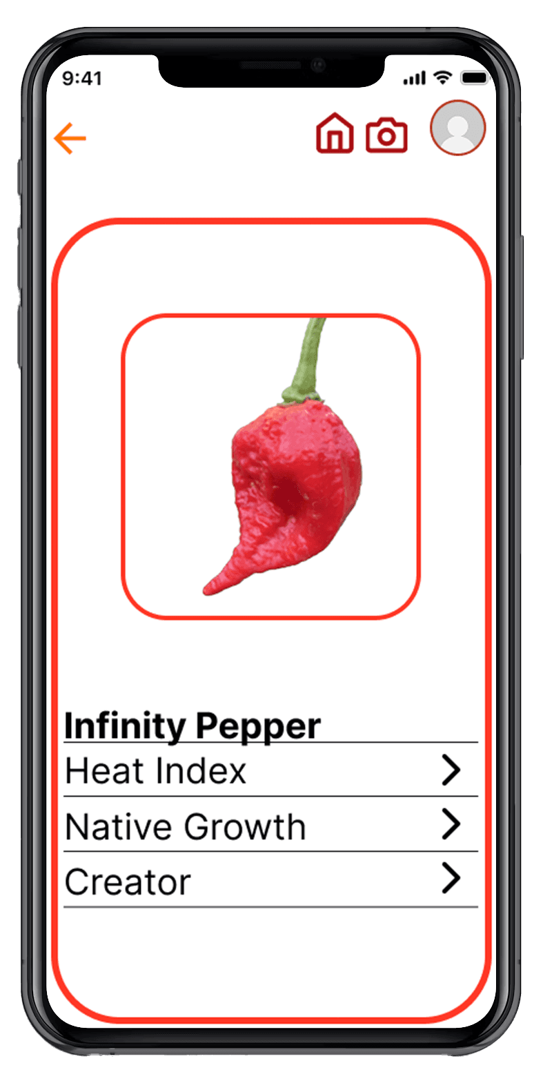
Pepper Pal is designed to help users easily identify and learn about different types of peppers. Many people encounter unfamiliar peppers while shopping, cooking, or gardening but don’t know their spice level or how they are typically used. The app allows users to search or scan peppers to quickly see their Scoville heat rating, background information, and common culinary uses. By providing clear and accessible information, Pepper Pal helps users feel more confident exploring and using a wider variety of peppers in their cooking.
Pepper Pal
Pepper Pal
Pepper Pal is designed to help users easily identify and learn about different types of peppers. Many people encounter unfamiliar peppers while shopping, cooking, or gardening but don’t know their spice level or how they are typically used. The app allows users to search or scan peppers to quickly see their Scoville heat rating, background information, and common culinary uses. By providing clear and accessible information, Pepper Pal helps users feel more confident exploring and using a wider variety of peppers in their cooking.
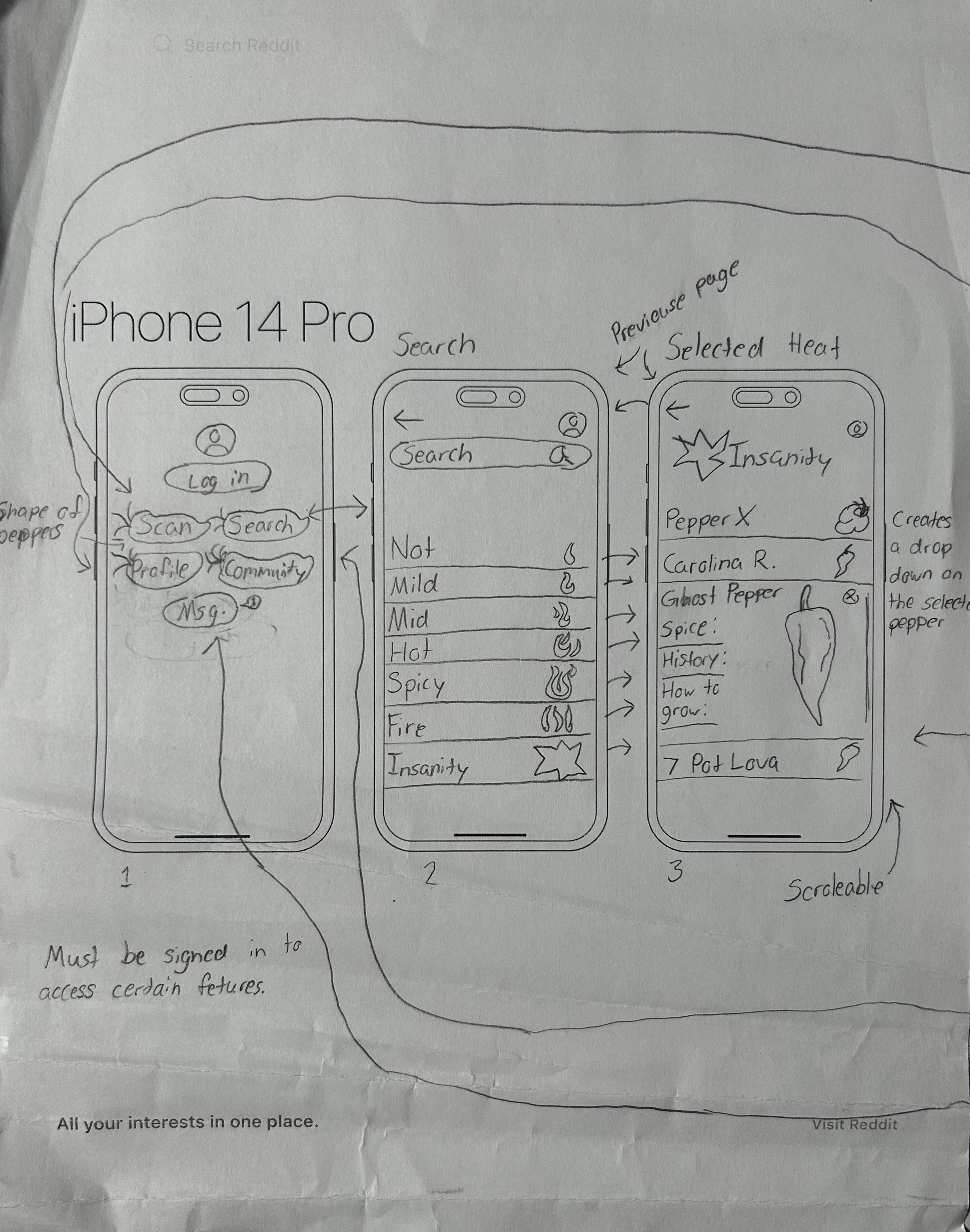
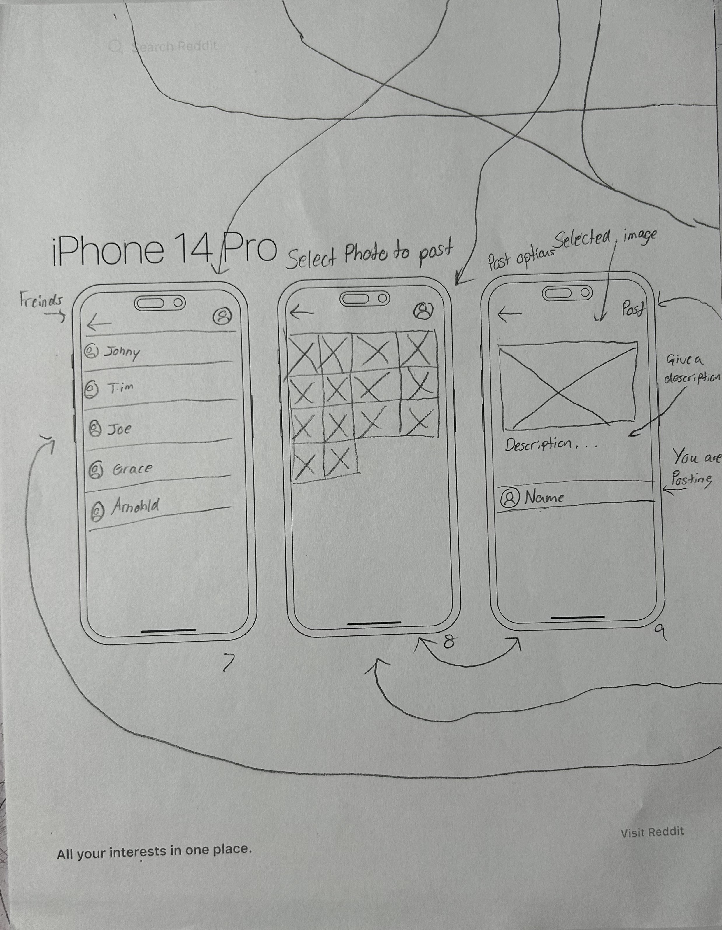
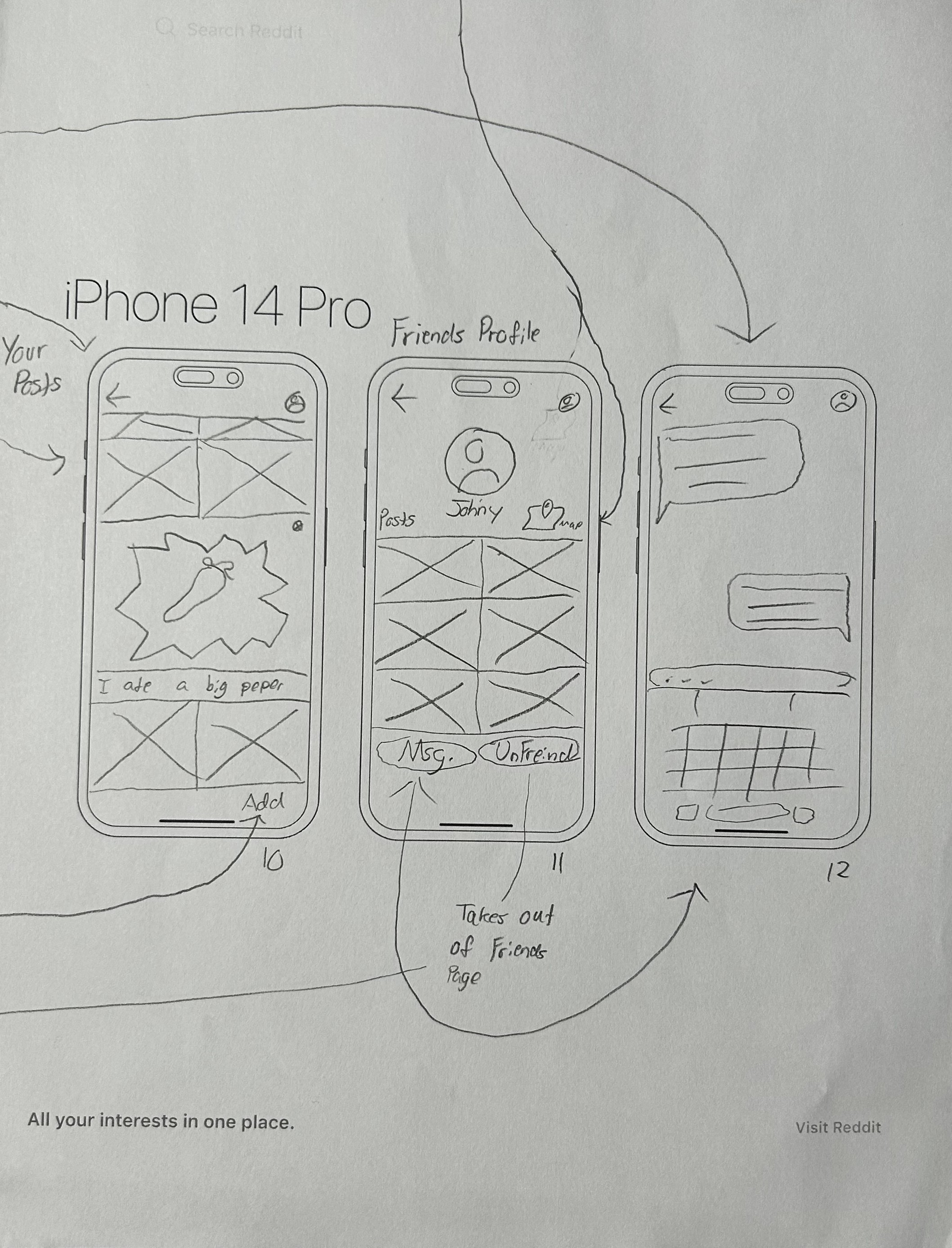
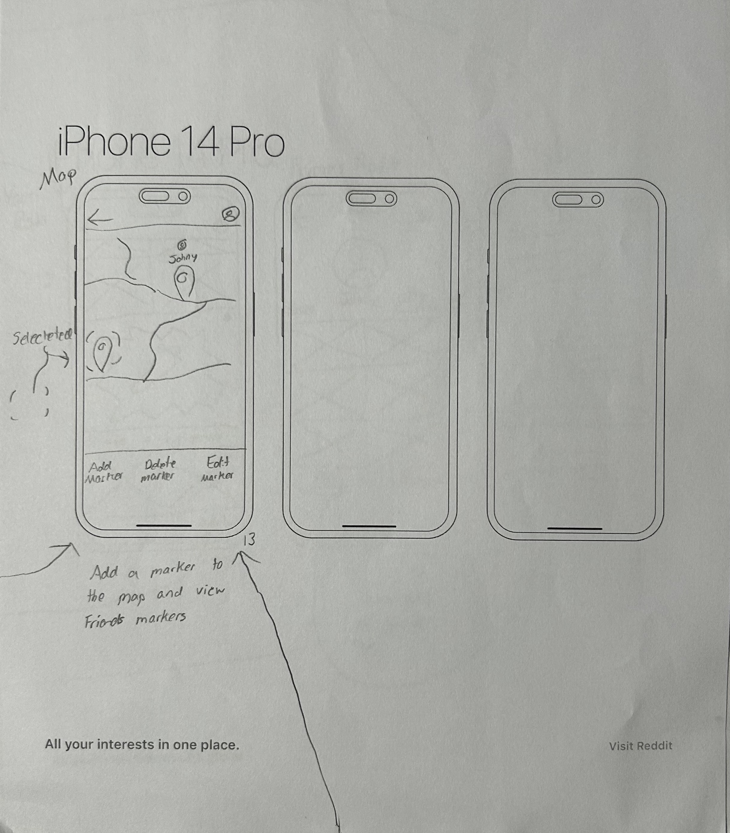
Early Ideation
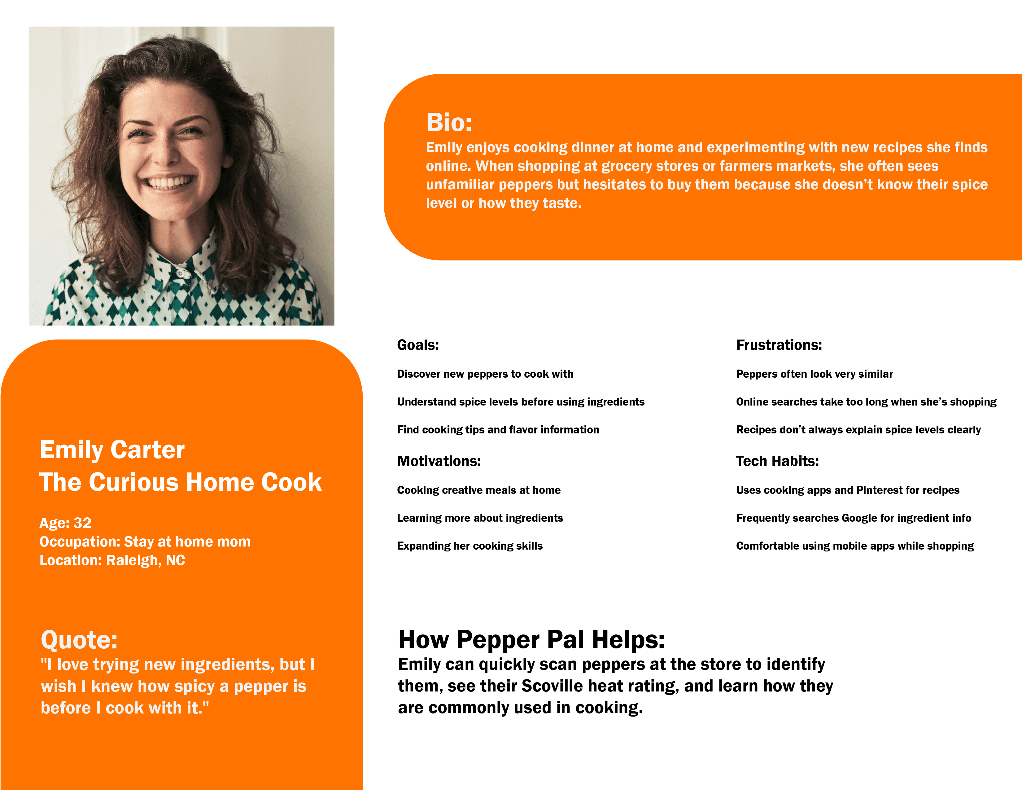
Personas
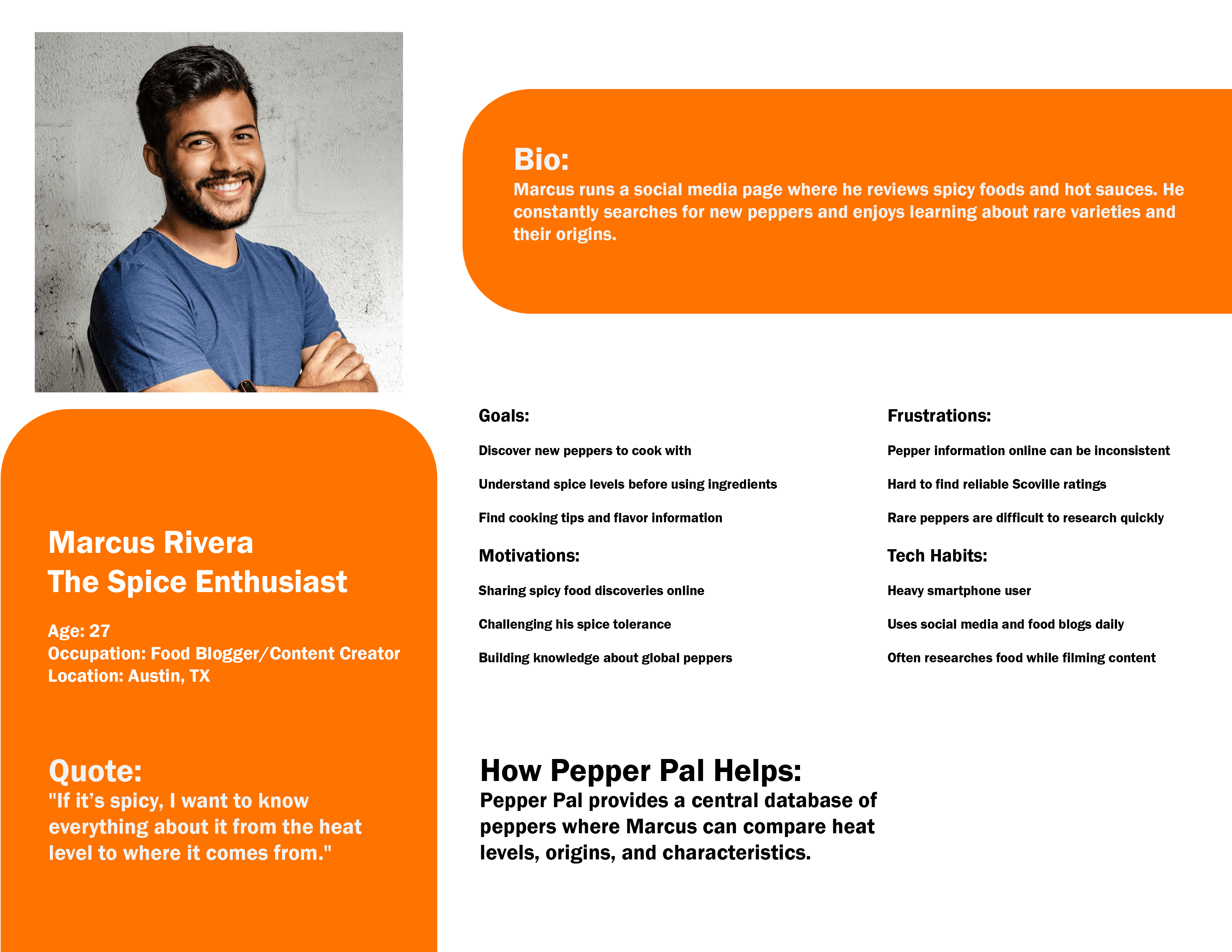
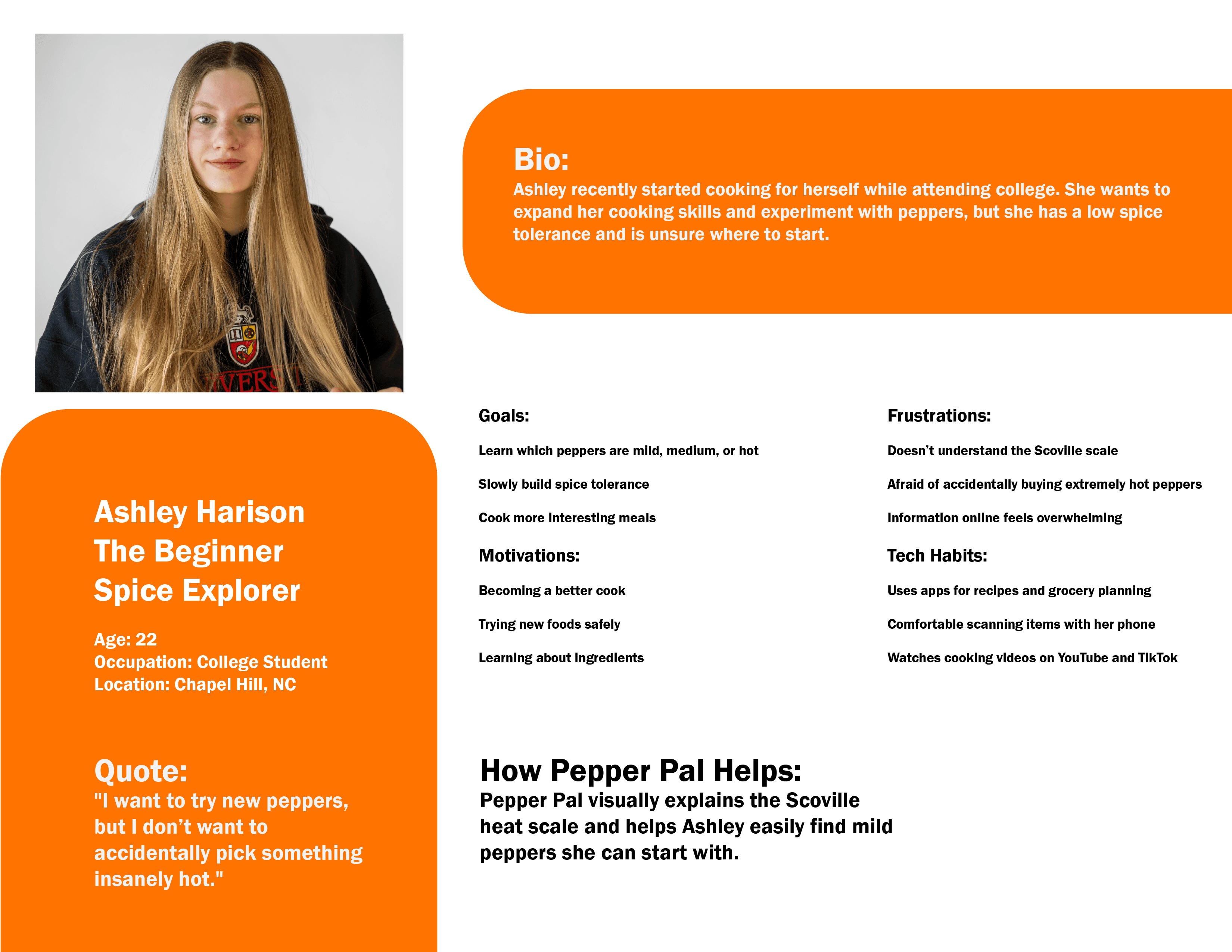
Coming up with three personas for the Pepper Pal app helped me better understand who I’m actually designing for instead of just guessing what users might want. I started by thinking about the main types of people who would use the app and what problems it solves for them. Instead of making them too broad, I focused on specific lifestyles, goals, and frustrations so each persona felt realistic. This made it easier to picture how different users would interact with the app in their daily lives.
The first persona I created was someone who is busy and always on the go, needing quick and efficient solutions. The second persona was more of a casual user who enjoys taking their time and values a simple, enjoyable experience. The third persona focused on someone who might be new or less comfortable with technology, so accessibility and clarity were really important. By making each persona different, I was able to see how the app needs to adapt to multiple types of users instead of just one.
Overall, creating these personas gave me a clearer direction for designing Pepper Pal. It helped me make smarter decisions about features, layout, and usability because I could always refer back to the needs of each persona. Instead of designing randomly, I had a purpose behind every choice, which made the app feel more thoughtful and user-focused.
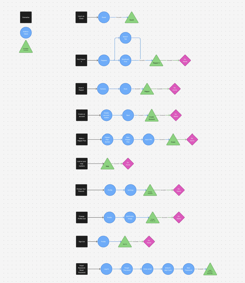
Scenarios & App Navigation
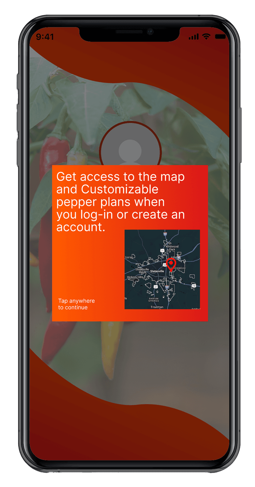
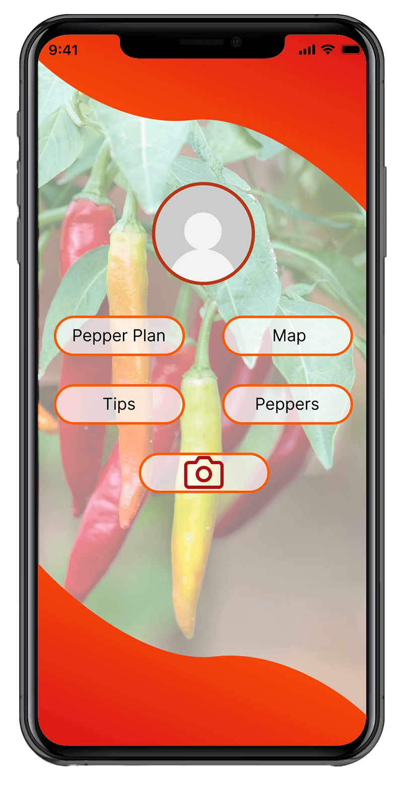
1. Log in as a Guest.
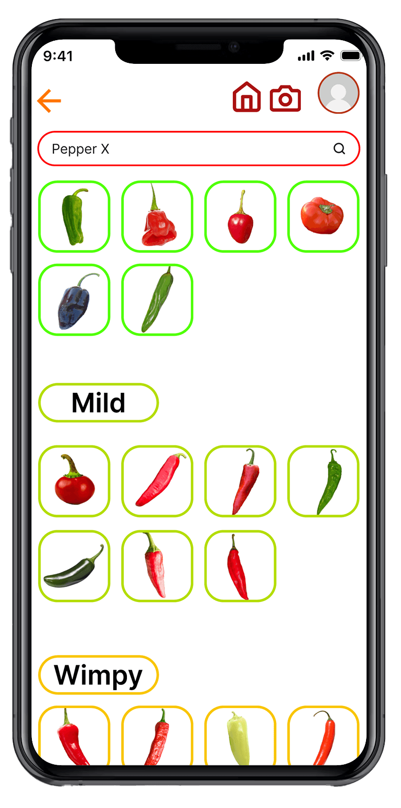
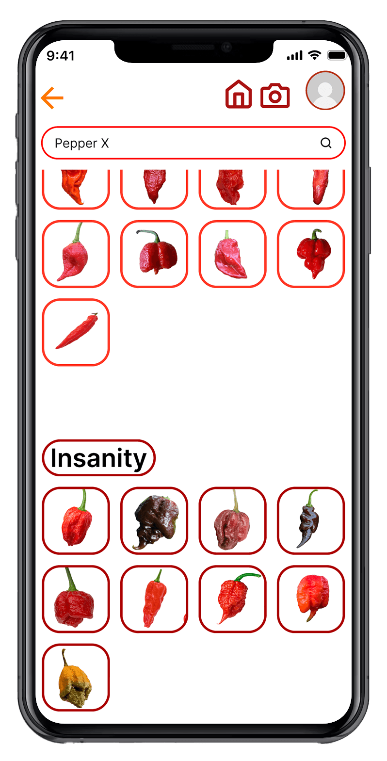
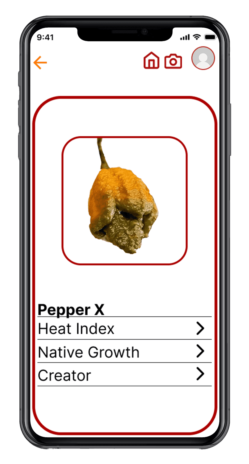
2. Find Pepper X
3. Scan Pepper
4. Create Account
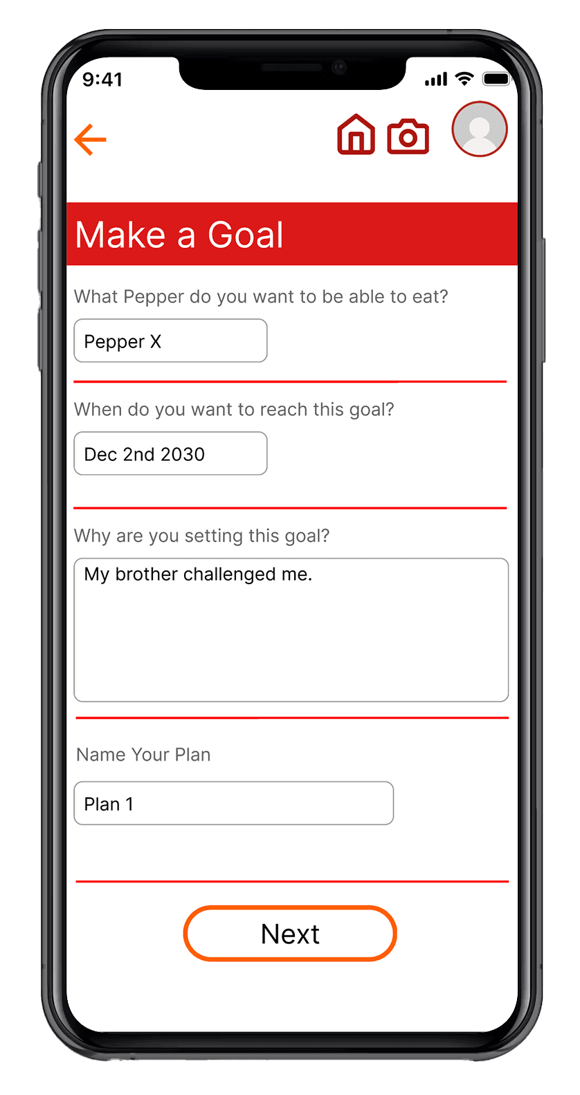
5. Make a Pepper Plan
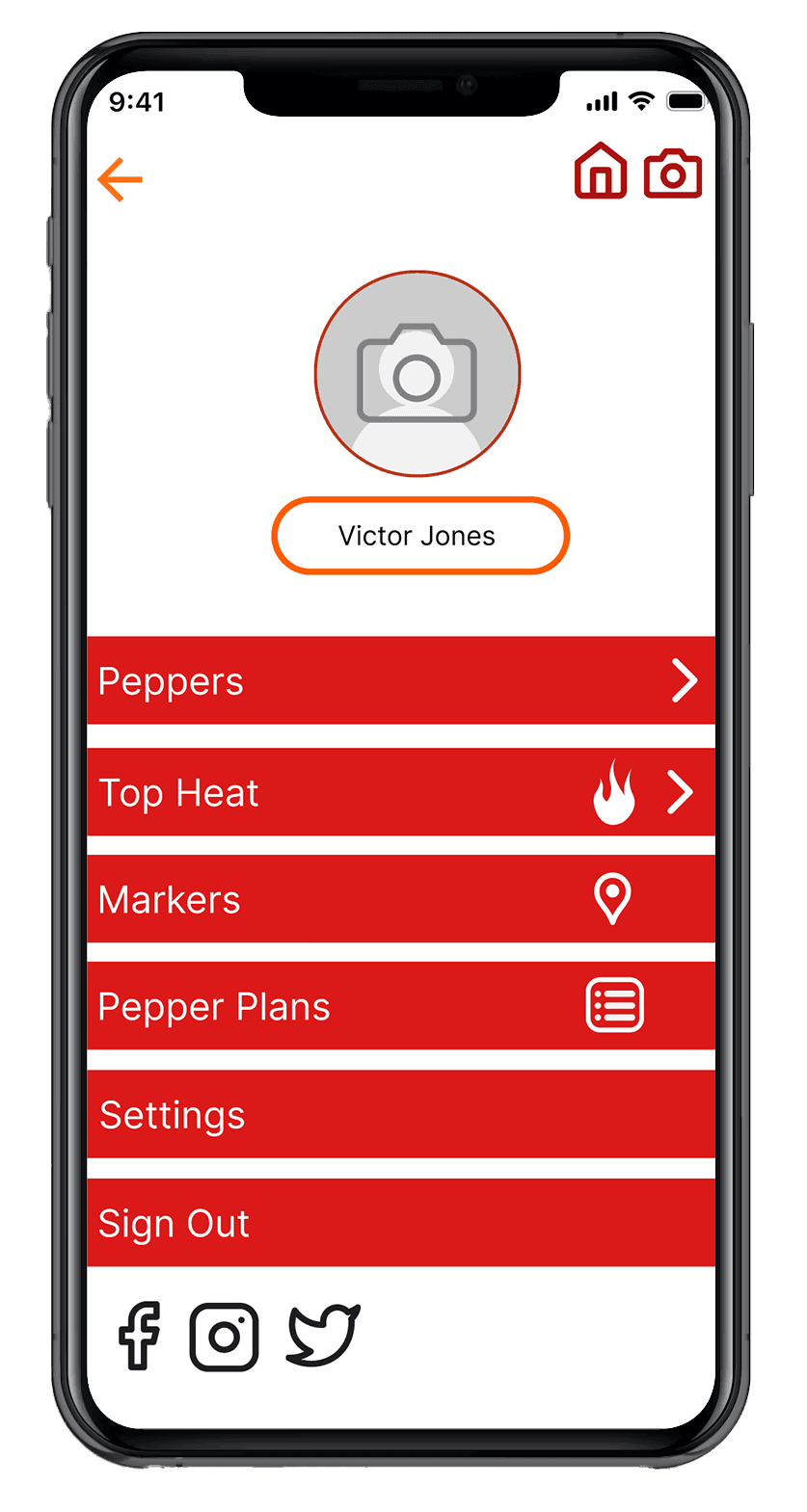
6. Look at your map markers
7. Change your password
8. Change profile icon
9. Sign out
10. Forgot password, reset password
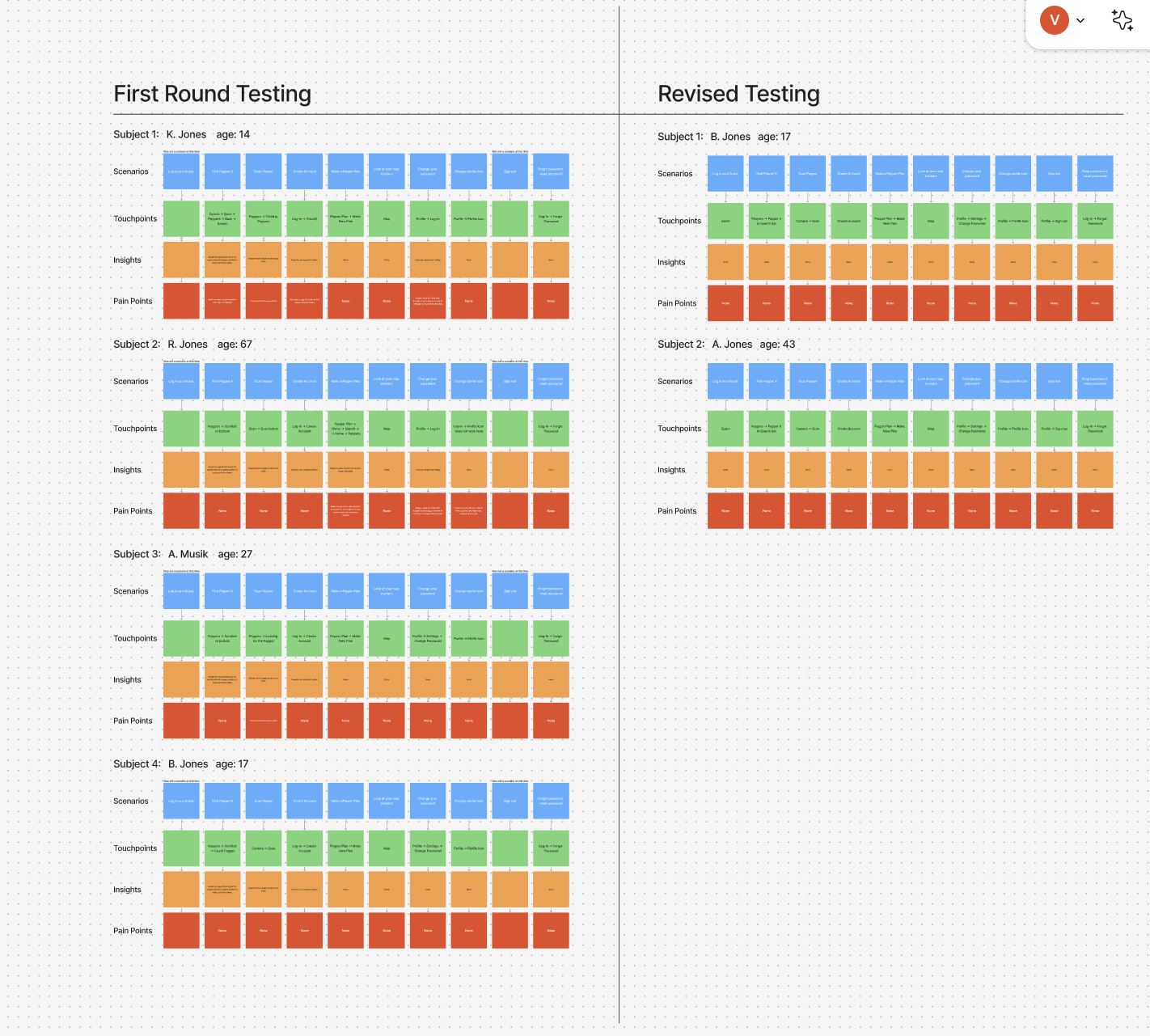
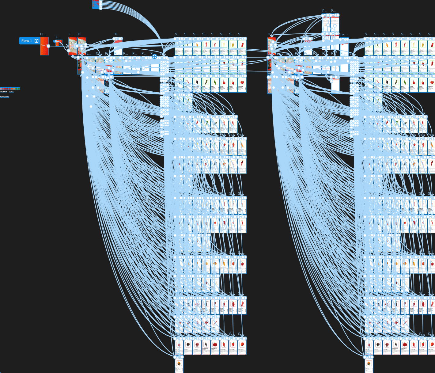
Testing
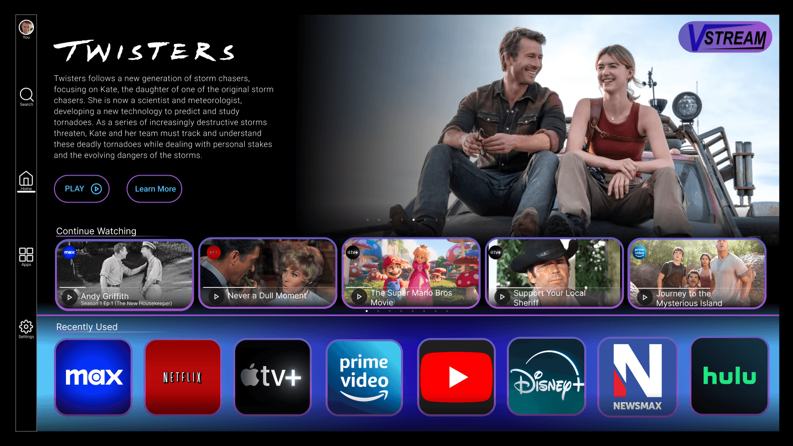
TV Home Screen
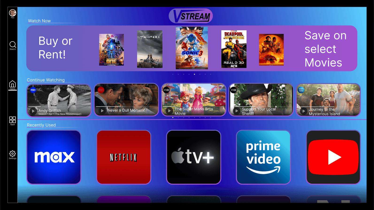
First Version
Final Version
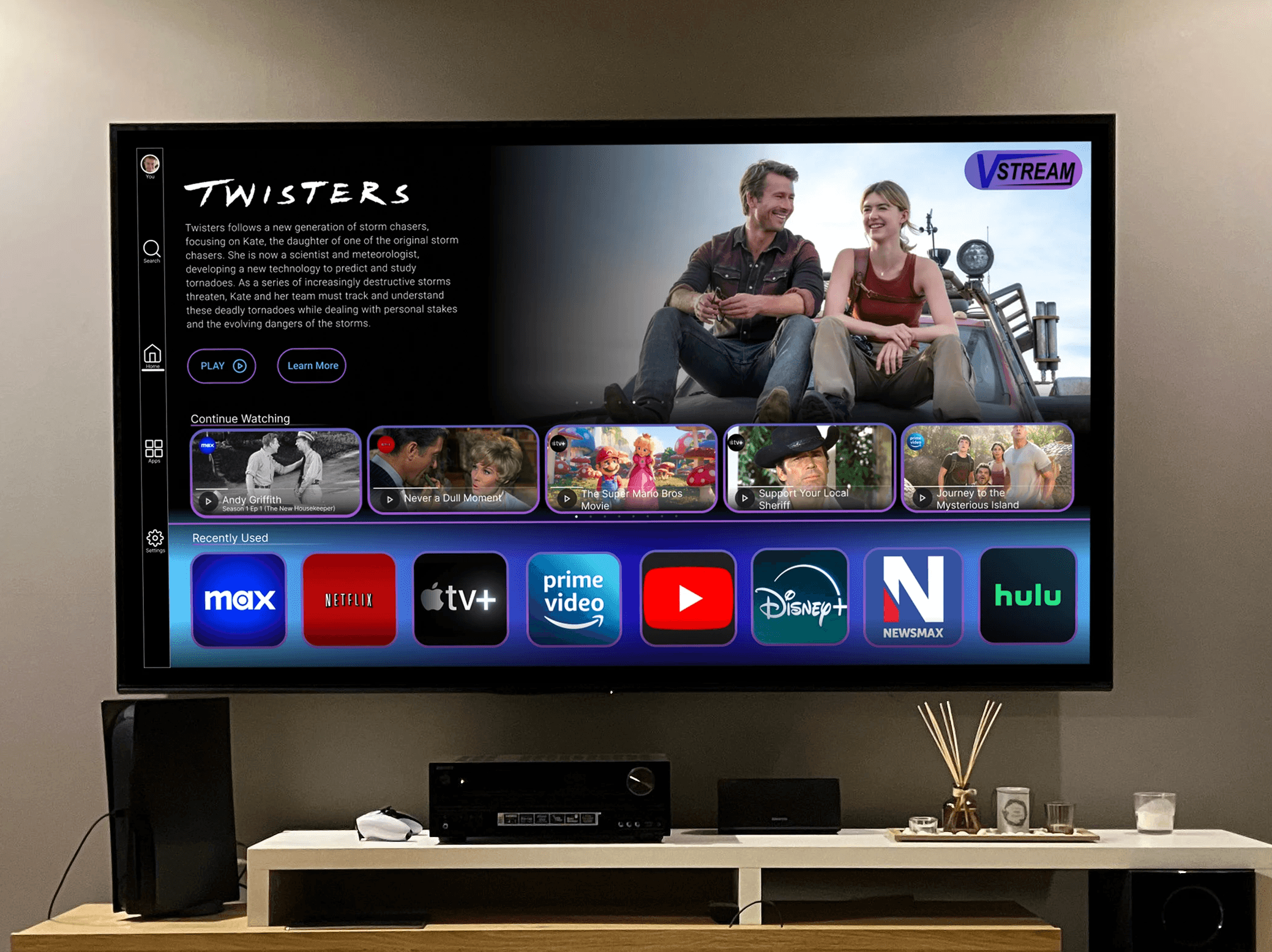
This interface leans heavily
into familiarity and ease,
using a streaming layout that
mirrors platforms users already
understand, which lowers the
learning curve and makes
navigation feel instinctive. The
strong visual hierarchy, anchored
by the large featured banner,
guides attention naturally
from primary content down
into personalized sections
like “Continue Watching” and
“Recently Used,” reinforcing
a sense of continuity and
ownership over the experience.
The consistent use of rounded
tiles, glow accents, and a
cohesive color gradient creates
a unified visual language that
feels modern and immersive,
while still allowing each app
or piece of content to retain
its identity. Overall, the design
reflects a user-first mindset,
prioritizing clarity, recognition,
and seamless content discovery
over complexity.
© 2026 Dapper Design. All rights reserved.
Design Dressed Well